The Alloy of Law
Brandon Sanderson’s latest book is a sequel of sorts to his fantastic Mistborn trilogy, and is set about 300 years after the events those books descibe.
Tantalisingly, he has started to write the type of story I’ve wanted to read (and failed to write) for years - a fantasy epic that spans large chunks of time and throws off a lot of ‘fantasy’ tropes. His original plan had been to write a trilogy of sequels set considerably further in the future, with technology levels at or greater than our own. I am aching to read those stories as they mirror ideas I’ve had for a long time. But, that’s not what Alloy of Law is. This book is a middle ground between the historical points the pair of trilogies were intended to mark. In Alloy of Law we have railway networks, the beginnings of electricity in general use, and the start of the motor vehicles era: it’s roughly equivalent to late 19th or early 20th century Earth. There are guns as well as magic. I adore the setting, it works spectacularly. I don’t doubt it will also upset a few “purists”, and that’s a good sign as far as I’m concerned.
The story itself is decent, witty, well paced, engaging, and well worth reading. The characters are likeable and well written. But none of it is not up to the standards set by the Mistborn Trilogy. This book was written to clear the authors head between other projects, and it shows in the lack of depth, detail, and length - this is a short book. What depth it does have come from the borrowings of the Mistborn lore and its setting within that universe. If this story remained largely the same but wasn’t explicitly Mistborn it would be a very pleasant throw-away novel, forgotten soon after reading. With that said, the ending pages (literally the last few) made my eyes pop and got me very excited. Those pages made it surprisingly clear that no matter how I’d enjoyed the book, it never got as good as the original trilogy. Those final pages also opened a heck of a lot of things up and left me with a feeling that Allow of Law is merely the first chapter in a much larger and more interesting story. Whether it is or not, I don’t know, but they made the entire book look like a minor side-arc while something truly momentous was going on elsewhere. I like that, weirdly. But I want to know so much more!
The book as an object
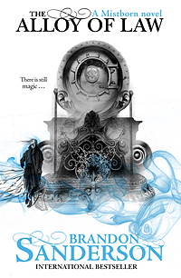
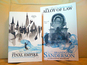
I ordered the paper-back because I happen to have the Mistborn Trilogy in paperback, and I wanted this sequel to fit comfortably next to those books on my shelf. The (beautiful and minimalist) art style on the cover is the same too, which is great. It’s a shame then that the publishers have had a “strategy meeting” and messed up the book itself. Rather than stick with the same format/dimensions as the existing trilogy they’ve produced a far larger book that has the following drawbacks:
- It’s out of place with the existing trilogy and doesn’t fit on the bookshelf
- It’s too big to comfortably hold one-handed as a soft-back, it’d be fine as a hard-back
- The book feels like some low-brow or teen-orientated affair due to the larger font and huge gap between lines of text
Now, I am pretty sure why they’ve done this, and the reasons are two-fold:
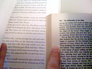
Firstly the story is much shorter than previous Mistborn books clocking in at around 90,000 words (compared to roughly 243,000 for the first book in the trilogy). Making the text bigger and increasing the gap between the lines is the same trick you likely used as a school-kid to pad out your homework and make it look more substantial than it was, which is why there are 80 fewer words per page despite it being a far larger page. Not that any publisher will admit to that, they will pretend that ‘the new format is easier to read and better for the consumer’. Because we all struggle so much with regular books. Putting this next to Tolkein’s LOTR paperback is a hilarious example of the discrepancy in information density between the physically larger book and the actually larger book. And I don’t think ’small print’ stopped LOTR, or the previous Mistborn trilogy, from becoming a success.
Secondly, I think they’re trying to get the fantastic artwork that is on internal pages displayed at a scale that works (and I suspect they feel having pictures in the book helps it sell to a younger audience too). Sadly, this fails regardless of the over-sized paperback format due to the decision to print that artwork at full-bleed, edge-to-edge. Which looks great, don’t get me wrong because I actually like that look, but it means you can’t read anything on that artwork that gets close to the spine. It felt like I was missing a treat that was right in front of me - like the proverbial monkey unable to get the cookie out of the jar as his fist is too big.
If I’d known before ordering that the paper-back book was like this, I’d have ordered the hardback version.