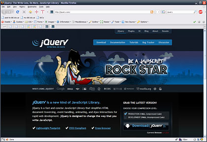
jQuery.com gets a redesign
And it’s brilliant. There are some complaints in the discussion that it looks unprofessional, but I think such criticism misses the mark. jQuery’s mission statement isn’t “technically brilliant framework” (though it is exactly that) it was described as “making JavaScript easier for Designers, Developers, Hobbyists, Businesses”. The entire point of jQuery is to remove the technical considerations and academic dryness of using standard JavaScript, and offer a far simpler method of getting the job done, that’s accessible to non-tech-heads. So the design should appeal to that crowd, not to the big-headed boffins that like nothing more than data tables and pages of dry specification.
This new design is artistic, expressive, and fun. Which is exactly what jQuery is about. I’ve even seen complaints about the project having ‘lost credibility’ and some people complaining that they won’t be able to convince team members or clients to use jQuery because of this design. Please, less of the melodrama. First off, there is no reason on this God given earth that a client should at any point be aware of what JS library you use, and certainly shouldn’t be in on the choice of one. You the developer are the expert, not they the client. It’s your choice not theirs. Secondly, if your team judges the effectiveness of a framework based on the look of the homepage, then your team has far bigger problems than you might think.
Personally my only real gripe is that the obvious love, time, and attention to detail that the homepage has seen didn’t make it to any of the content pages, which look rather default and boring (it’s a sea of plain text and lists). Come on jQuery guys, in for a penny in for a pound! There are a couple of lesser gripes too, but they really are just nit-picking: the rounded corners from the top half of the homepage haven’t made it to the bottom half of the homepage for example, which seems like an oversight. And while I agree with the sentiment of having fun, the header itself doesn’t feel right. I don’t like the idea that I might want to be a ‘javascript rockstar’. Put something else pretty there instead please 
Entry Information
- Posted:
- Fri, 29th Aug 2008 at 09:08 UTC
- Filed under:
- Tags:
