Photoshop web design template
Being a web designer, I tend to work on a lot of websites. In order to speed up the process I’ve made a few templates that I can use when starting work on new projects. From a pre-made folder & file structure, to mark-up examples, to Photoshop files. In this particular case I’d like to share one of the Photoshop templates I use quite often, in the hope you will find it useful.
The aim with this template is to speed up the production of mock-ups that can be presented to a client. I’ve always felt it best to try and re-create exactly what the client would see if they were to visit their as-yet-not-built website on the web. With that in mind, this template includes a browser chrome. Appearing to have the site situated in its ‘final home’ (a browser) can make quite a difference to how the design is perceived, and how authentic it feels. This template includes the chrome for someone who has a desktop resolution of 800x600, and another at 1024x768. Switching between the two is as simple as toggling the visibility of one layer, so it’s very easy to see how good the design looks in both contexts, and just where ‘the fold’ sits. This particular template is set up for a centred design. If your design is to be left-aligned, you need to move the 800 layer-set flush left, and optionally move a couple of the guides.
Design template layers
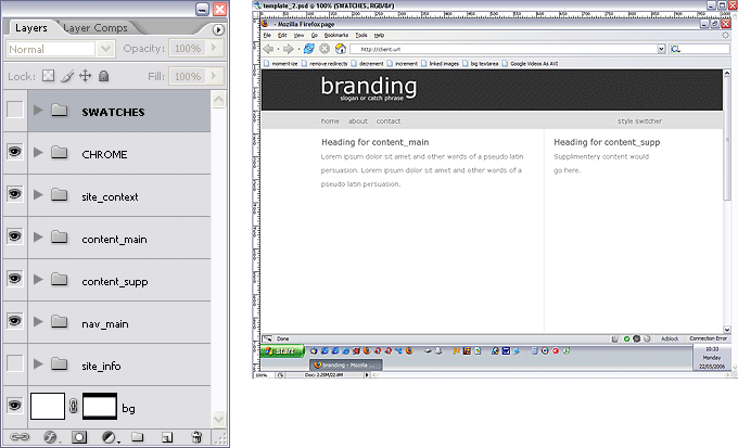
The top two layer-sets are capitalised to set them apart from the others. This is because neither are part of the design per-se. The SWATCHES layer group contains the colour swatch for the design. It is mostly left invisible, excepting when I want to colour pick from it. It’s unfortunate that Photoshop’s built-in colour swatch system isn’t up to the task. The second layer group, CHROME, holds the layers responsible for the browser chrome. They contain sub-folders for the 800x600 resolution, and the 1024x768 resolution, and a ‘blanking’ layer between the two. Sometimes I find it useful to turn this layer on, sometimes off - all it does is obscure the rest of the design when viewing with the 800 layer-set.
I like to design while keeping the mark-up that I would use in mind. That is why the non-capitalised layer sets are named as they are - these are the names of the divs I ordinarily use in my mark-up. They may need a little explaining as they are named semantically rather than visually.
- site_context
This is the equivalent of ‘branding’. The site heading, slogan, and any contextual text would go in here. It’s the first thing in the mark-up, and it usually lives at the very top of the designed page.
- content_main
This is where the main body of the page exists. Visually it is often laid out as the left column in a two-column design, though this need not be the case.
- content_supp
This is where content supplementary to the main page is kept. Visually it is often the right column in a two-column design.
- nav_main
This is the ‘main’ or ’site’ navigation. Sometimes there needs to be a sub-navigation (nav_sub) or supplementary navigation (nav_supp). This is not often the case, which is why the template doesn’t have layer-sets so named.
- site_info
Can often be thought of as a footer.
- bg
The background of the design. It’s not called ‘html’ or ‘body’ or ‘container’ because the background, often as not, can be attached to any of those. It’s easier to just call it ‘bg’.
Using the template
Although I find this a good starting point for a design, it’s never the case that a full design will fit in the height constraints posed by the browser chrome. When I find myself out of vertical room, I simply extend the Photoshop canvas vertically and amend the chrome layers to the required height.
Now if only Adobe incorporate Freehand’s ‘assets’ library functionality, then I can add form templates as assets, and the template will be even more useful. 
Download the Photoshop template
Please note: the template is only compatible with Photoshop CS2 or higher.
Entry Information
- Posted:
- Tue, 23rd May 2006 at 20:05 UTC
- Filed under:
- Tags:
Comments
skip to comment formNice Jimi I like it. It certainly begs a few questions that have been floating around in my mind lately. I have been arguing in my head if it's right to product clients sites from a set template as it may not come across as maximum value for money, but surely there is a very valid argument that there is a right way to display a website. After all when it comes to brochures a set pattern is usually always followed as the norm.
As I see it, whether you think templates are good or bad depends on the template and how you intend to use it.
I don't see any problem with the template approach as seen above, because my template is not about creating a specific 'look'. There are conventions to web design just as there are to any other media. The template is nothing more than a way of speeding up the creation of the most general and fundamental design choices that are normally made.
For example, the 800x600 screen size is one that you just can't ignor, and you will always need to check against it - so the template is set up so you can do that right away. The same can be said about 1024x768. Most websites have a header of some sort, and many have multiple colums - so that's how this is set up. Of course, the ratios change more often than not, and sometimes there's only one column etc.
The point is that, for me, this is the best possible starting place. If something in the template doesn't fit my idea for a design, it's easy to change because the template itself is very basic. It's better than just staring at a blank canvas and measuring out the same guides every time you do a design.