Commissioning a website
This post is a re-publication of one I wrote on the View Creative blog. It’s aimed at new clients or people considering approaching agencies in order to commission a new website.
Commissioning a website can be confusing, especially if you have little experience with websites from the perspective of a site owner. Don’t worry, we’re here to help you figure it all out. But before we can talk about details we need to know more about you, so we can properly understand your needs and begin to address them…
Why do you need a website?
You have a business need you believe a website will address, but what is that business need? We need to know so that together we can figure out the most effective ways a website could help. Establishing what the objective of a site is in terms of measurable business impact also means we can assess the final product once it’s complete, to see how successful it was at meeting your needs.
Who will be using your site, and how?
Now we know your needs, we must think about your clients and visitors needs; who is it that will be visiting your site, and why would they be there? If you have an existing site we would love to see any statistics you have so we can get a clear understanding of how your current site is being used, where it succeeds, and where it might be improved.
Do you need a strategy to deal with people accessing the site from non-computer devices, like mobile phones and tablets?
Mobile phone’s and tablet devices like the iPad are more and more the way that people are viewing websites, in addition to (or sometimes instead of) traditional computers. Such devices can be very limited in comparison to a “real” computer, so if a reasonable portion of your visitors will be using those devices, you will want some strategy to offer a more compelling experience for them than they might otherwise get.
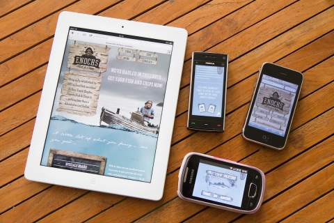
Not all site’s need special consideration for mobile devices, but it’s generally a bit more future-proof and almost always means a more pleasant experience for users.
This might be a confusing area for you, if so we are happy to discuss it to find out whether it’s an issue that’s relevant for you, as well as a number of different approaches if it is. We’d also want to discuss the pro’s and con’s of those approaches.
When thinking about whether non-computer visitors are something you care about, bare in mind that this user group is growing rapidly; it’s worth considering how long you expect your new site to exist before being re-designed or replaced. It’s very likely that the proportion of mobile users visiting your site will greatly increase in the next couple of years.
What’s the budget?
Clients can be a bit reticent to tell agencies their budget, which is understandable as without experience it’s very hard to know how much things ought to cost. However we do need to know how much you’re willing to spend because it directly informs how much time we can spend on your project, and what solutions are viable for you.
Knowing your budget sets realistic expectations for both parties, can stop time wasting, and in turn means money more wisely spent.
Remember that we want a happy customer – not just from personal desire and professional pride – but from a business perspective too. It is in our interest to have a happy customer because happy customers help bring us future revenue. So we’re not looking to spend all of the budget just because it’s there – we’re looking to give you the best and most appropriate solution, even when that means telling you the budget is more than is required and a simpler and cheaper website will do all you need.
Our working process…
Once we understand everything above we can turn to the website itself and begin thinking about what it may need in order to be successful, and what it might not need. This is where we can use our experience and knowledge to help guide your decisions, ensuring considered strategies are appropriate, and help ensure time and money that might be better spent elsewhere isn’t wasted. If you’re new to this, or haven’t worked with View before, here’s an outline of how we’d like to work with you:
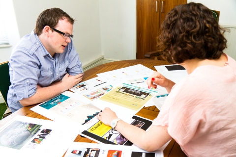
1) An initial discussion between you and the team members who will work on the project
An open discussion for any and all ideas and thoughts related to the site. At this stage we are aiming to establish broad requirements and directions – nothing is too crazy and everything is relevant. Talk can range from specific technical objectives to favourite colours and anything in between.
2) Establish a suitable visual look and feel through “mood-boards”
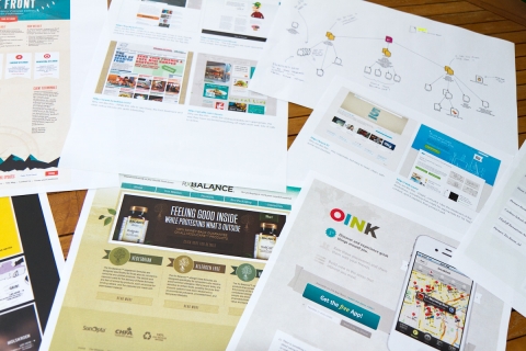
We will do some research based on the results from the initial meeting; looking at other websites, brands, and products, as well as anything else we’ve seen recently that we think is appropriate. This research is used to collate examples of visual styles we think might work for you.
We share these examples with you, discussing which elements you like and which you don’t. This informs our artistic direction before we do any actual design work.
3) Organise your content
While we are working on the mood-boards we’d like to work with you to establish the content that will come to form the website – what are you going to want to talk about? How much are you likely to say about it? Will it be all written words, or will you have pictures and video’s too? If you’re stuck, we are happy to help here too.
This is critically important. We need to know what content you will have so we can produce an effective website and visual design – your site exists only as a means to present your content, and your site visitors are only there because they want that content. That means we need to have a strong grasp of what’s going on the site and how it will be organised before we do any visual design work.
The content doesn’t have to be final completed copy, but the more accurate it is the better it will be for the design overall.
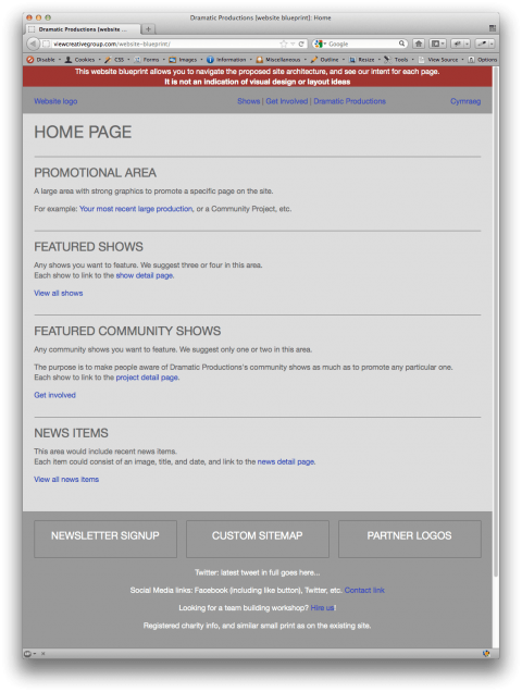
Once we know what your content is we will come up with a clear organisation, and will present it to you as a “website blueprint”. A blueprint is a bare-bones version of what the website will be, a plan we can work from. It has no visual design and no real content – but it allows you to click through to the various pages and sections we propose the site should have. Each page lists what type of content would be on that page, and any functionality it would have (like a contact form). You can see an example of a website blueprint that’s for a pretend client “Dramatic Productions Inc”.
It is important you are happy with your website blueprint, we would require you to sign-off on it. You would be saying “the final website will have the same navigation structure, and each type of page would do as described here”. This means there would be no surprises for either party in the future development of the site, and everything will have been considered.
The design and build process
At this point we know what visual styles you like and will be apropriate for the project, we know what content is going into it, and how it’s all arranged structually. Now it’s time to work on the visual design…
4a) For traditional ‘computer-only’ websites
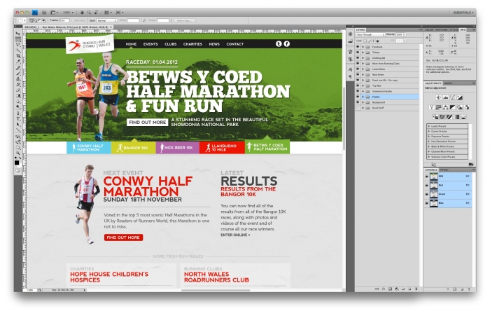
At this stage the designers will take the signed-off blueprint and apply their design ideas to those pages. This work takes the form of a picture, and is not a working web page. The designers would then get feedback from you about the look and feel of those pages, working with you to create a design for each page that works well and looks great. Once you’re happy with that picture of the page you’d sign it off. With everything now established and agreed we would build the real web page to reflect the signed off designs as closely as possible.
4b) For websites involving responsive designs
The workflow is a little different than for ‘computer-only’ websites due to the nature of responsive websites.
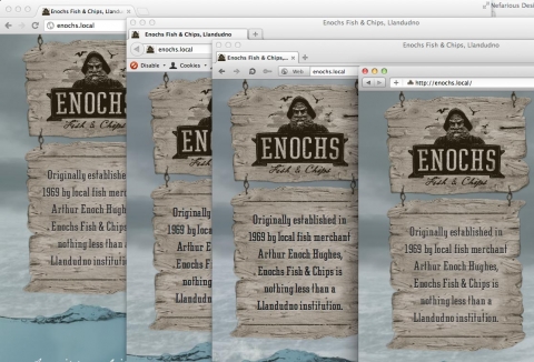
A responsive website changes its layout and design when viewed at different sizes, this allows a pleasant experience for everyone regardless of the size of their screen – from a mobile phone to a big computer. Because of this flexibility, we can’t provide a flat picture of what the site will look like and then build a real page to match the picture.
Instead, our designers create a mock-up of how the pages might look, so you’re happy with the general idea, but you would not sign-off this design. We then build the smallest version of this page, and ask you to sign it off when you’re happy with it at that size. Once signed off we build the next size up, and ask you to sign that off too. And so on, until we reached the largest version of the page.
We do it this way is because a change to one size will often impact others. It’s a bit like building a wall brick by brick – you start at the bottom and work up, but if you then want to make a change to one of the lower bricks it can unsettle bricks higher up and cause them to crack.
Once the build is finished
We then test the website on a variety of devices and using various browsers. These include the latest versions of Firefox, Chrome, Safari, and Opera – on Window and Mac. We also test in Internet Explorer 7, 8, and 9.
If your site is also intended for display on non-computer devices we’ll test it on iPhone running iOS5 and iOS4, iPad1 and iPad3, Opera for a number of Android devices, and a number of Android devices using the built-in browser.
Once we’re all happy that everything is working correctly on each of those browsers the project is effectively finished. At this point we will request you sign-off the complete project and we will then put the website live for the world to see.
At this point we will arrange training for you so you can learn how to use the content management system and administer the website yourself. In some projects this training can happen earlier to allow you to put content in yourself ready for going live later. Which way around this is done varies from project to project, depending on which is appropriate.
Entry Information
- Posted:
- Sat, 2nd Jun 2012 at 09:06 UTC
- Filed under:
- Tags: