Enochs Fish and Chips, Llandudno
Earlier in the year we did the identity, branding, and print work for Enoch’s, our favourite local Fish & Chip shop. Now, we’ve just launched Enoch’s new website – and we’re rather proud of it! We were determined to push the boat out for this project to reflect the passion and quality of Enoch’s itself. What we’ve shipped is a website that looks great on mobile phones and big computers, with a fun nautical theme and – if you’ve got a nice new computer or mobile phone – some playful animations too!
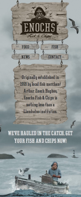
Thanks to the enthusiasm of Danny, who commissioned the work, we were able to take this project as an opportunity to see how far we could push a modern website whilst staying within best-practices for web standards and accessibility. So we’ve used no Flash or any other creaky insecure plug-in’s to achieve the animation; this is pure CSS3 and HTML5, which Google and users alike will love. And we’ve been able to create a site that changes its layout to display the content as perfectly as possible whether you’re on an old phone, a new phone, a tablet device, or a desktop. Not that you have to try the site on those devices to see what I mean, just try resizing your browser on the computer – you’ll see how the layout changes.
What’s that? You don’t see the layout change, or any animation? Hello there my Internet Explorer using friend! Don’t worry, this is expected and indeed intentional – Internet Explorer is something of the black sheep of the internet family, and after a few years of delinquency it’s been put in “remedial classes” to catch up with the other kids. It can’t do animation or fancy adjusting layouts just yet. But IE’s had a change of attitude and has been studying hard – the next version will get all this fanciness too. Meanwhile, you get to see the site as desktop users would and get to enjoy a static non-animated version. You can always download a new browser if you like, there’s Google Chrome, Firefox, Opera, or Safari you might enjoy.
Technical Gubbins
OK, you want to hear more about the technical aspects? Here we go:
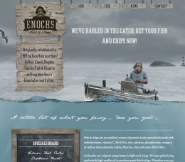
This site uses a mobile-first approach to create a responsive design. Which means the site is as efficient and fast as I can make it for any given user, and it also displays the content appropriately for any user too. No more having to zoom in-and-out of a desktop-size website on your mobile phone. No more mobile specific website and another desktop-specific website. This is just one website, that squeezes itself and re-arranges to fit whatever device you’re looking at it on.
This is a design lead site too, to fit in with Enoch’s existing themes and design for the shop and print work. Which means it has rather a lot of graphics. We’ve used cunning design and fancy-pants image compression to shrink this down to acceptable file sizes, which mean the site is between 700kb and 1Mb to load (depending on your screen size). That’s on the larger side of an average website at the moment, and although bigger than we’d normally like it’s a trade off we all felt worth it in this case.
The site itself has a small and simple Content Management System that allows Danny to edit the text and add new news items, as well as display his latest Tweet. We chose Perch which fitted the bill perfectly.
What I did
Everything except the visual design of the PSD. I adapted that visual to work as a real website, created image assets, built the site, conceived and wrote the animations etc.
Entry Information
- Posted:
- Thu, 26th Apr 2012 at 09:04 UTC
- Filed under:
- Tags:
Comments
skip to comment formHey Matt,
 It kinda looks unprofessional, actually.
Wicked site. One thing I didn't like is the unnatural way the fish move.
P.S. Sorry to point this out but I noticed that you have a severe problem distinguishing between plural and possessive cases
Give this a quick read: http://zatz.com/authorpower/possessive-vs-plural/
P.P.S. Plug-ins instead of "plugin's".
It's a beautiful site. I keep showing it when I'm selling the idea of responsive design in to prove that they don't all have to be minimal, gridded (dare I say dull?) sites.
Lovely work.
So, ah, things.
1) The menus are images, which I assume is to ensure they look the same as the physical images, but does make it very hard to do a computer search on. (And for people using screen readers.)
2) I have a (possibly abnormally) large default and minimum font-size - 16. This means, among other things, that the "Originally established in …" sign has text running off it, and I can't finish reading that the place is an institution (unless I disable CSS).
Otherwise it looks very nice, very clever. I particularly like the way the signs move.
So I guess I should note that I had JS turned off for my when viewing the site and making the previous comment. Which does make a difference.
@MarkL - thanks

Yeah, but considering the limitations of CSS animation, this is about as good as it gets right now. I considered adding keyframe switches so they'd become an animated sprite but ran into problems combining that technique with animating the position. Looks like CSS at the moment can't do that.
@John
Thanks
@Michael
Yep I'm aware of the issue with the food-menu's being images. That's not in our control, although we did bring it up as a problem with the site owner - it's a content issue and I agree it's a big let down.
With regard to the overflow problem: this isn't to do with your default font size (the font here is actually set larger than 16px) but much more likely you're running AdBlock or similar which is stopping the CSS @font-face from loading (yeah, it makes no sense to me either, but it's a common problem). Unfortunately this font has a much smaller x-height than any system font we could use, which means when the system falls back to a default font it looks too large and will over-flow. It's a limitation of CSS at the moment, there's not a reliable way to fix it - though in the future a new CSS property called x-height-adjust should help limit the problem.
This is one of the best websites I've seen for a long time, just beautiful, not over done, just great design, and development in a sweet marriage, brilliant.